Silvia’s kitchen
Overview
This project involved renovating a compact kitchen within a studio apartment.
With its sizable window and lofty ceilings, maximizing natural light was a priority. To achieve this, I decided against installing upper cabinets near the window, as suggested by IKEA. This choice ensured that the window remained unobstructed, allowing ample light to filter into the space. I also preserved a small opening between the kitchen and bathroom walls to maintain light flow into both areas.
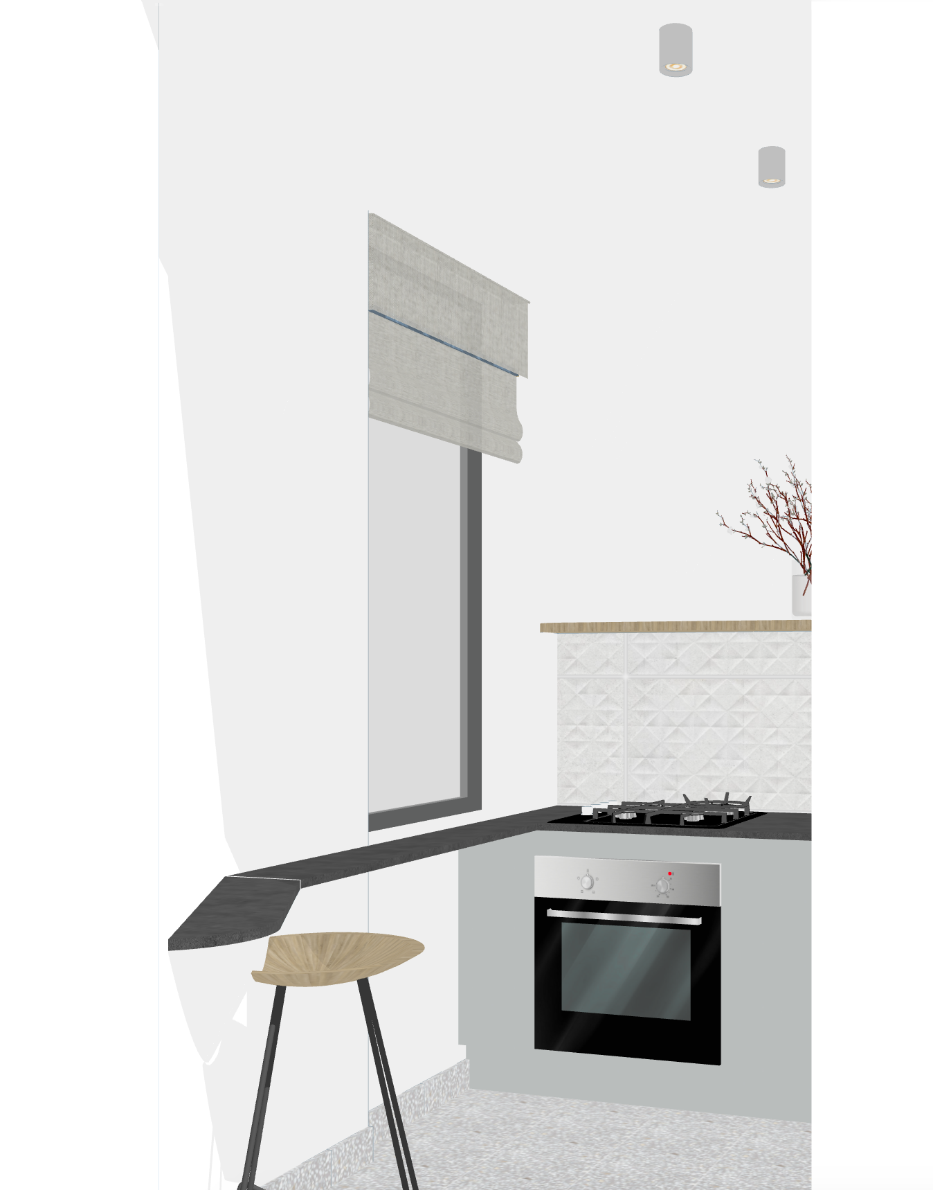
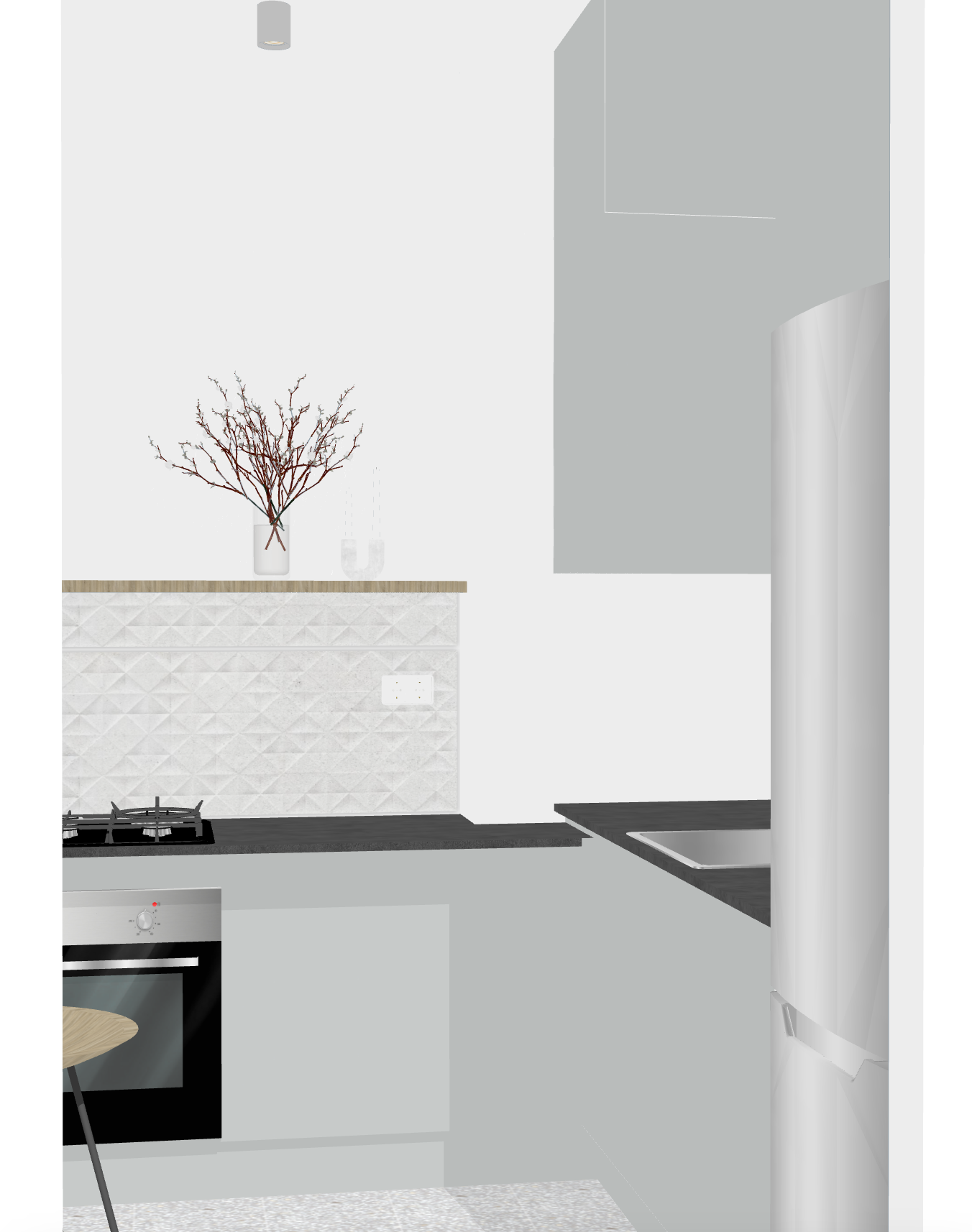
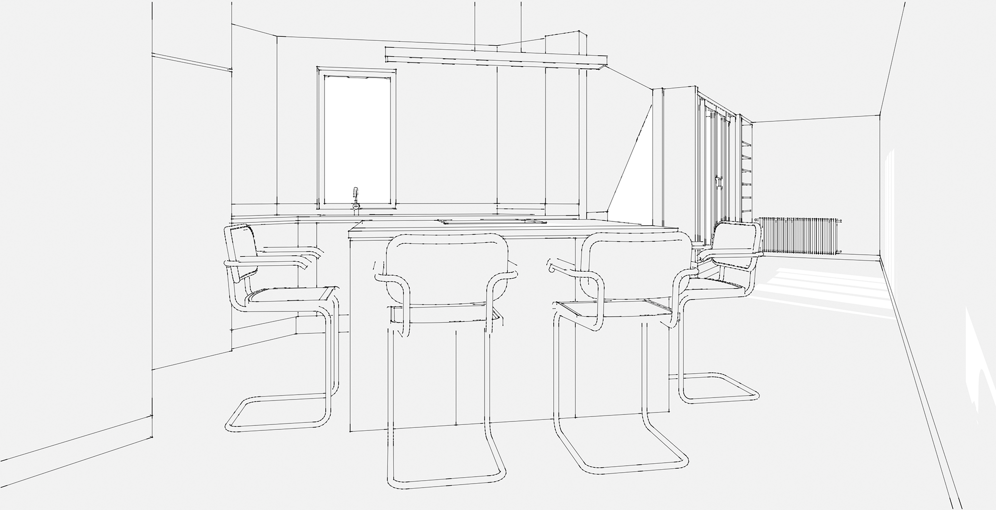
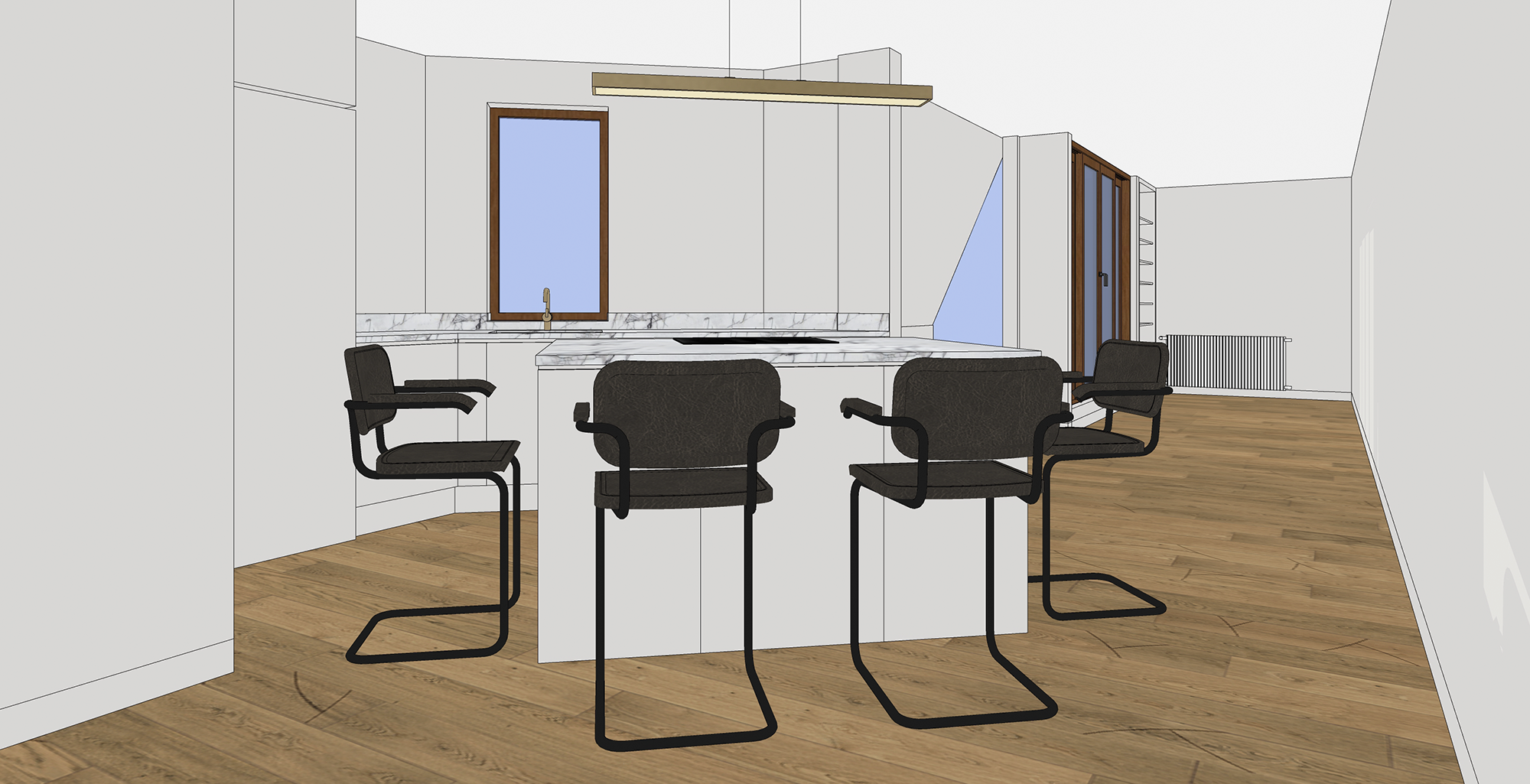
Most of the kitchen storage was strategically positioned along the bathroom/kitchen wall, with a few lower cabinets on the opposite side to balance the layout. Alternatively, a narrow breakfast bar could be considered to maintain the room's spacious feel and minimize clutter as seen in my drawings below.
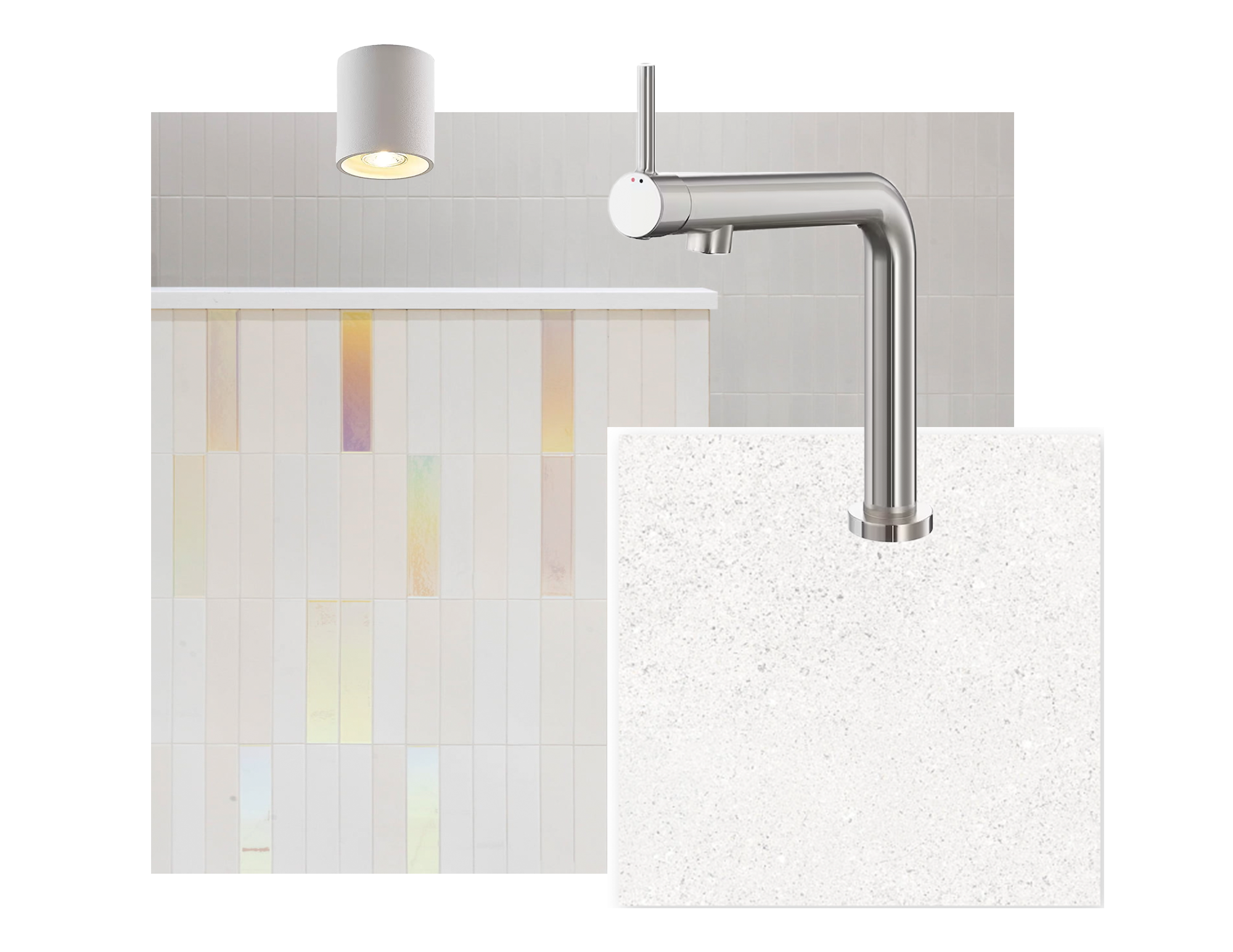
Inspiration/material board
perspective drawings
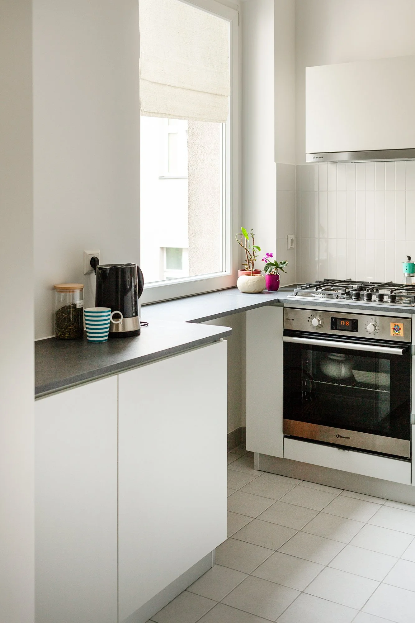
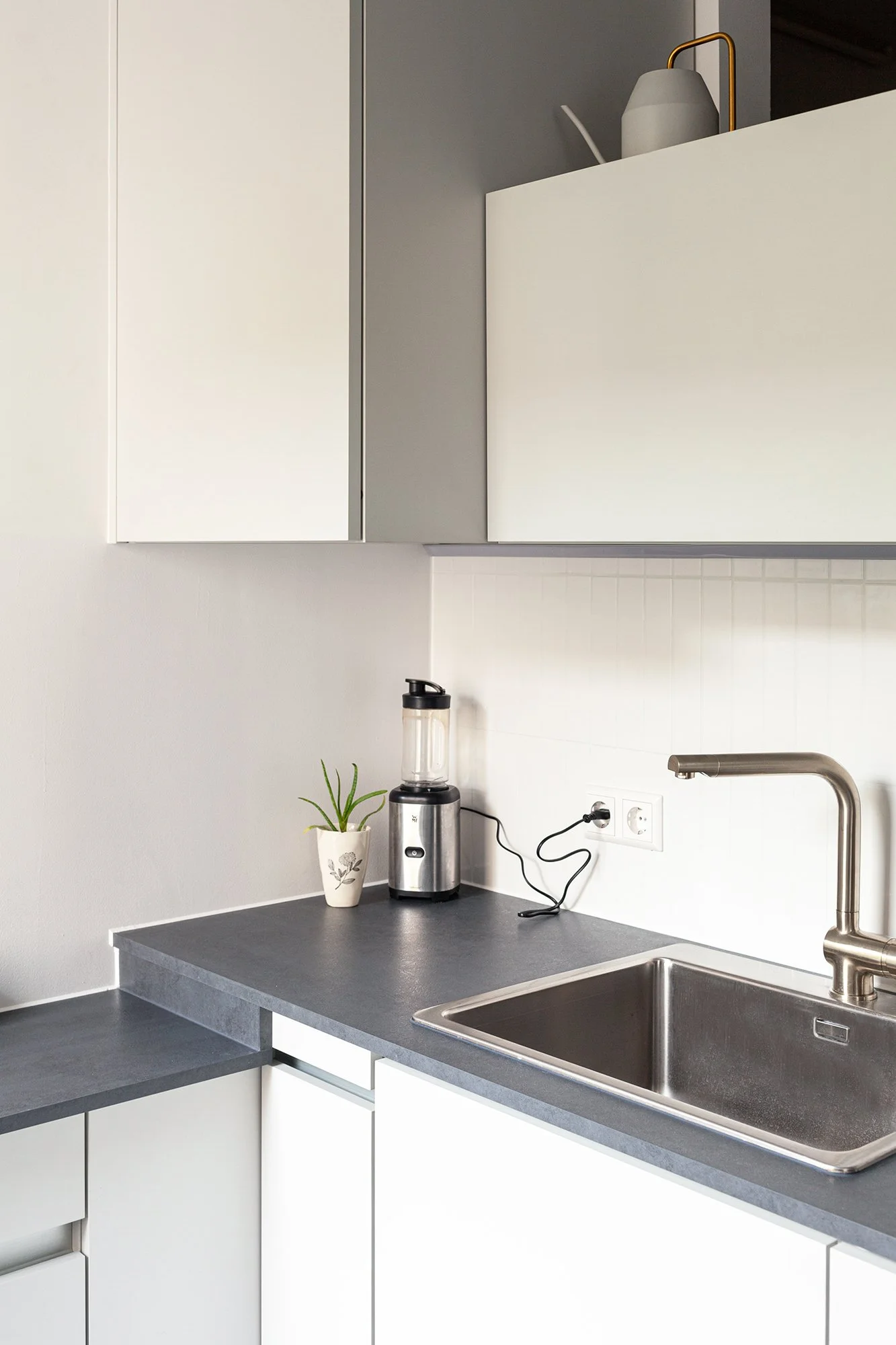
The Actual kitchen
The kitchen was designed with two levels to seamlessly connect one of the walls with the window sill, creating a cohesive visual flow between the kitchen area along the front wall and the storage space on the adjacent left wall (or breakfast area as depicted in my drawing).
We made a tweak to the original design by opting for Spectre tiles from the renowned Italian brand 41zero42 for the backsplash. Additionally, the client chose to retain her existing ceiling light to align with budgetary considerations. The outcome is a sleek and minimalist kitchen that fulfills the client's request for ample storage space.
Here’s what Silvia had to say: “I recently had the pleasure of working with Victoria on my kitchen redesign and had a great experience. She took the time to truly understand my vision, offering thoughtful suggestions that helped shape my ideas into a well-rounded design. The final result is both stylish and practical, making my kitchen a functional and beautiful space. Victoria maintained clear communication and professionalism throughout, making the entire process seamless.”
ozgur kitchen & powder room
Overview
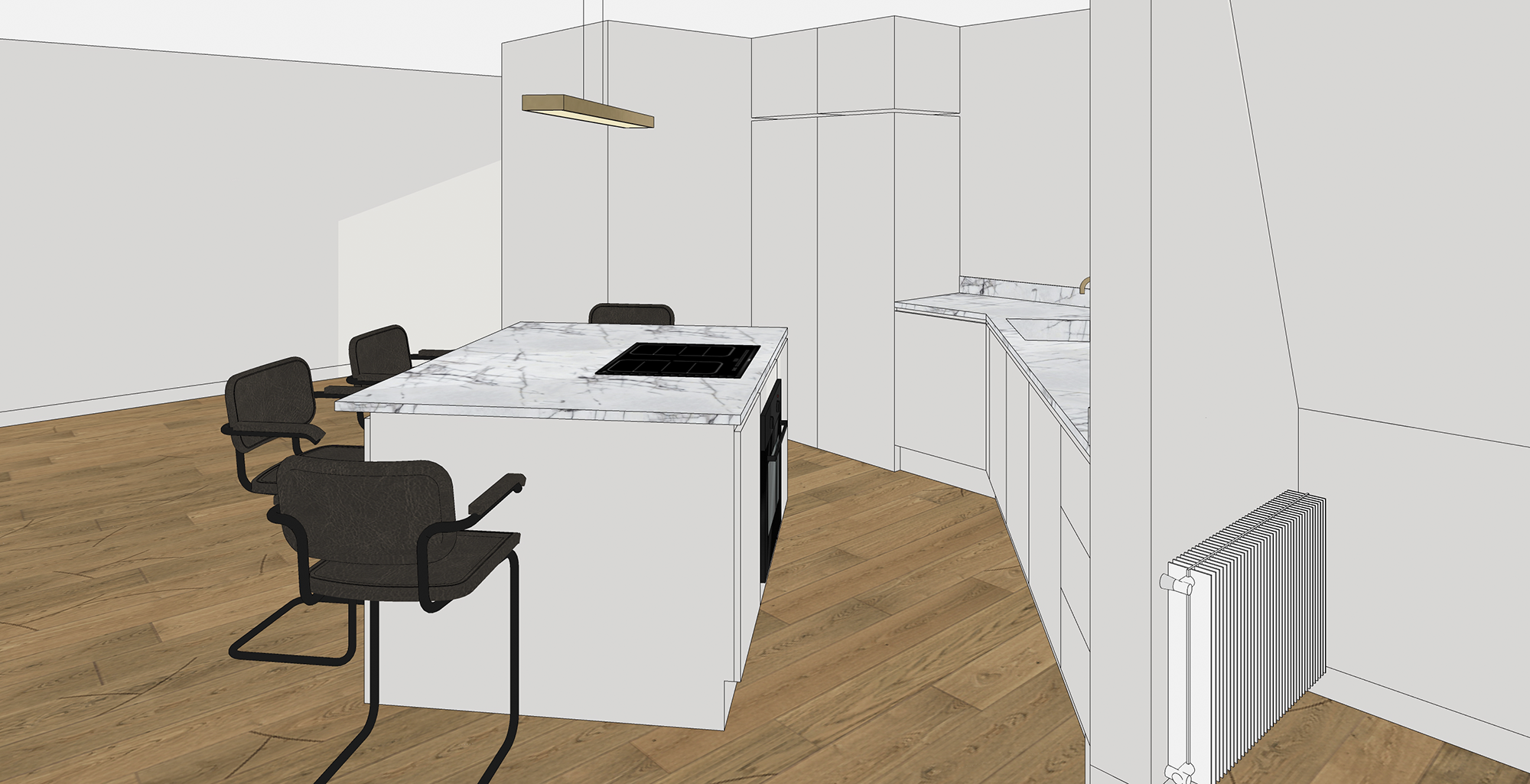
This two-story apartment spans 100 sq m in size. For the kitchen, the primary objective was to optimize storage space while incorporating a washer/dryer unit. Additionally, the design aimed to integrate an island that could double as a dining table. The owner's preference for natural materials, clean lines, and contemporary aesthetics guided our choices.
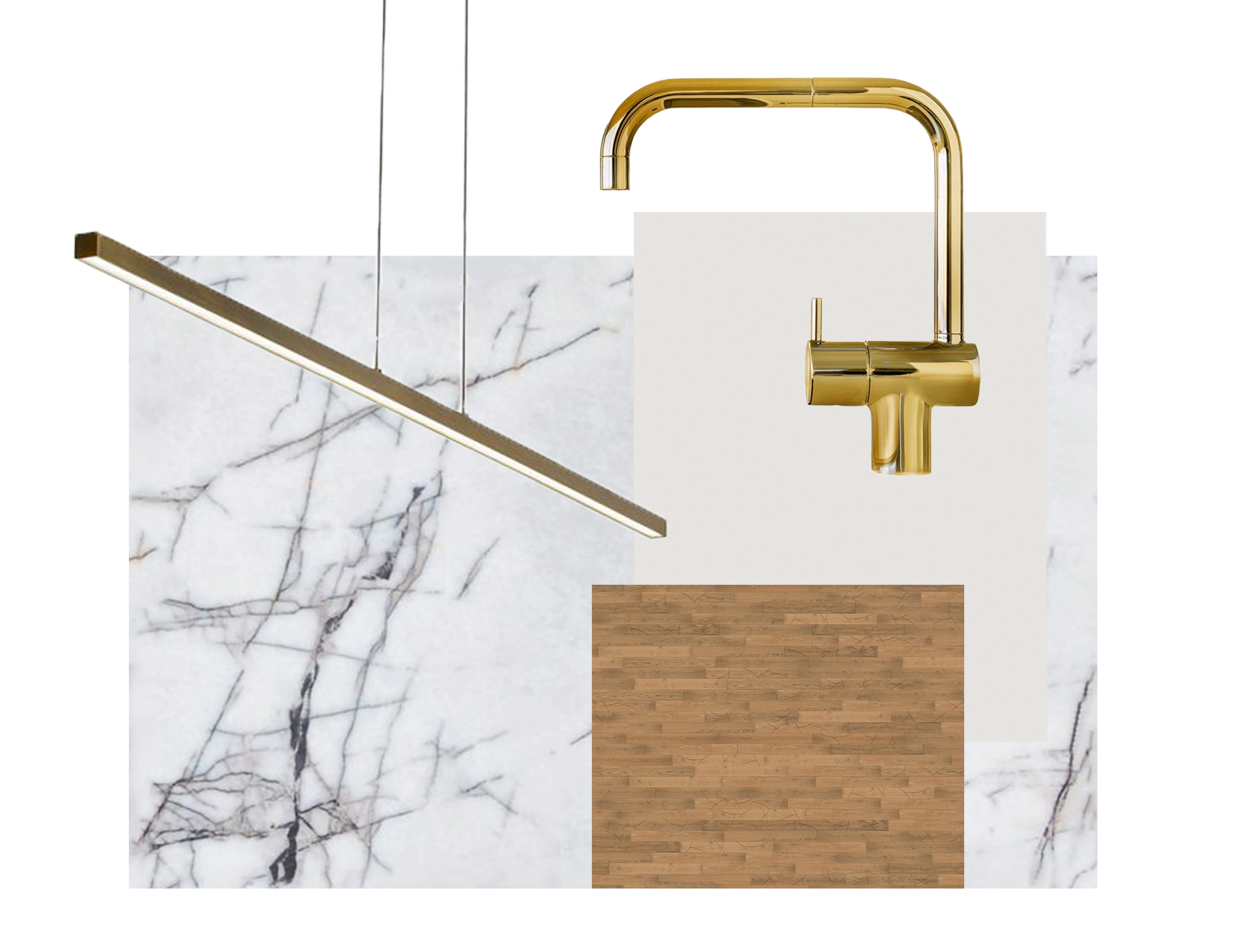
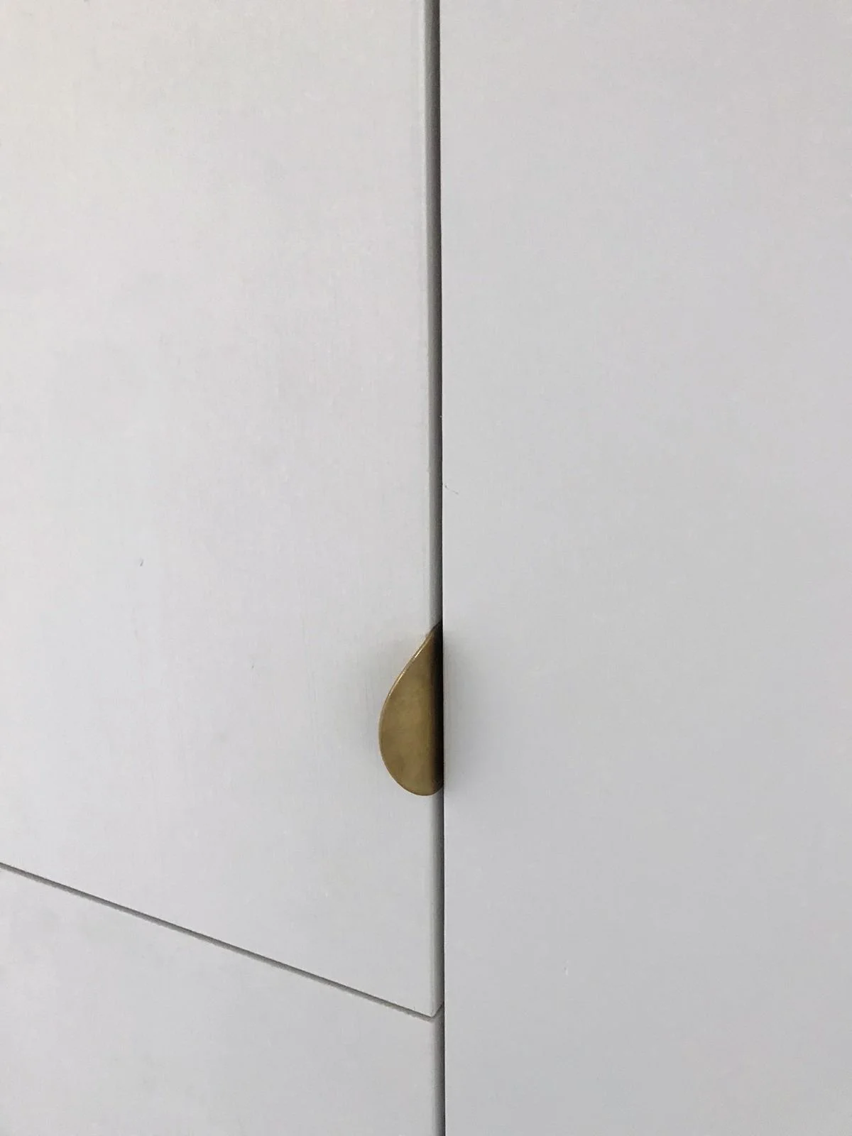
To achieve a timeless and straightforward appearance, we selected white marble countertops with striking black veins. The floor-to-ceiling wooden cabinetry, painted in the same hue as the walls, further enhanced the no-fuss, seamless look that perfectly aligned with the owner's style preferences.
perspective drawings
material board
powder room
The wood cabinetry detail in the photo was painted in the same color as the walls, captured by Alex Becker, the carpenter involved in the project.
In the powder room, located right next to the kitchen, I opted for a touch of drama by painting the walls with the rich hue of Farrow & Ball's Hague Blue. To complement this bold choice, I selected a black toilet and a stone sink with a black finish, while adding elegant brass fixtures by Vola. To ensure visual coherence and consistency in my design, I used the same marble material used for the kitchen counters, extending it to cover the floors of the powder room, creating a sense of repetition and unity.
Powder Room Sink Elevation
Powder Room WC Elevation


