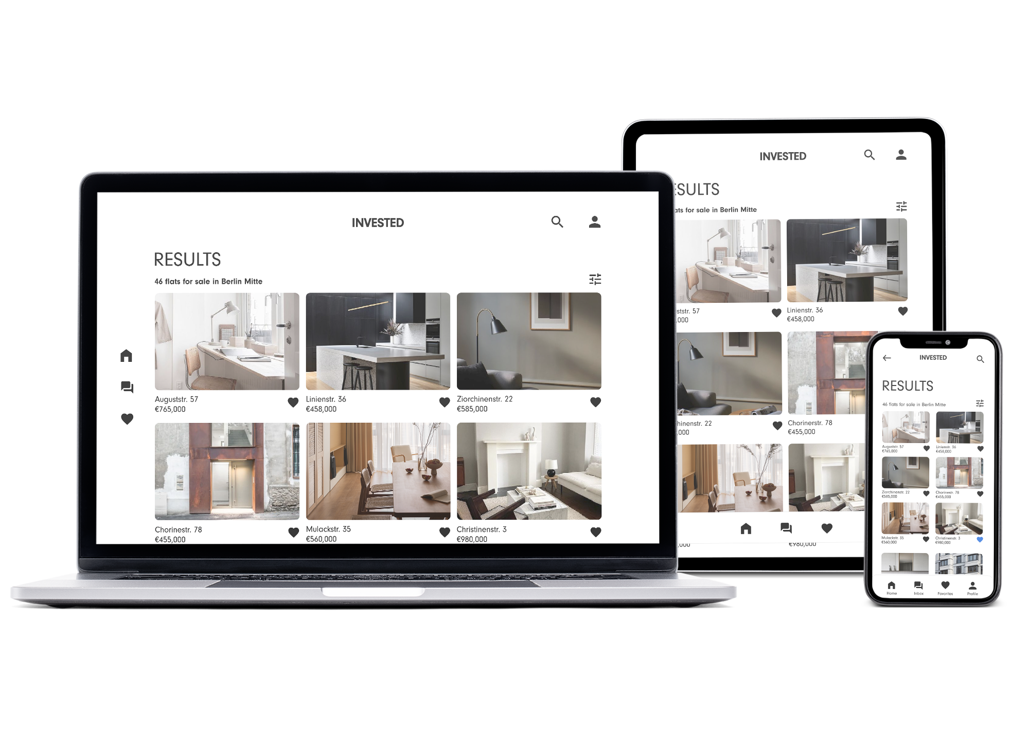
responsive web app
Overview
Goal: Design a user-friendly, responsive web app for new, small-scale property buyers seeking additional income or financial security.
My approach: Invested provides a simple, reliable way for inexperienced buyers to explore real estate opportunities. The platform allows users to search residential properties and land, review key details, and make informed investment decisions from anywhere.
The core challenge was to differentiate the product from other real estate tools that were functional but visually outdated. I aimed to create a clean, clear, and elegant visual language that would appeal to modern young professionals.
Role: As the sole designer, I led the entire process — from user flows, moodboards, and wireframes to high-fidelity designs and the final prototype. My toolkit included Adobe XD, Illustrator, and Photoshop.
The final prototype is accessible here.
Disclosure: The hero image on the splash screen was taken by Zhao Yangyang, while all the other images are from Pinterest.
mid-fidelity wireframes
moodboard
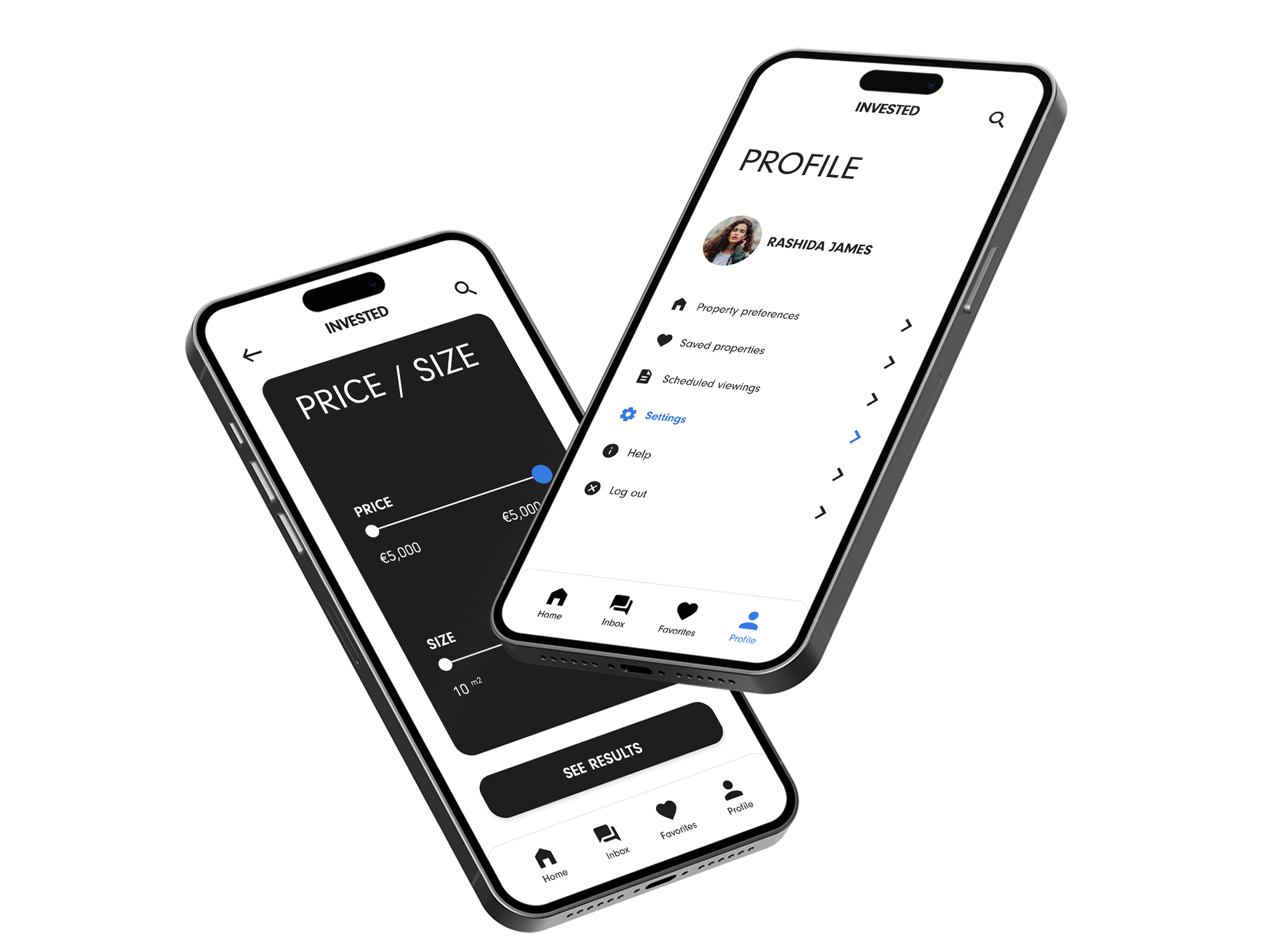
I began with a broader palette of black, white, bright blue, and pink paired with sans-serif typography. As the design evolved, I refined the palette to three colors — blue, white, and a soft black — to create a cleaner, more focused visual system. This adjustment softened the contrast and ensured the bright blue worked harmoniously against the dark background.
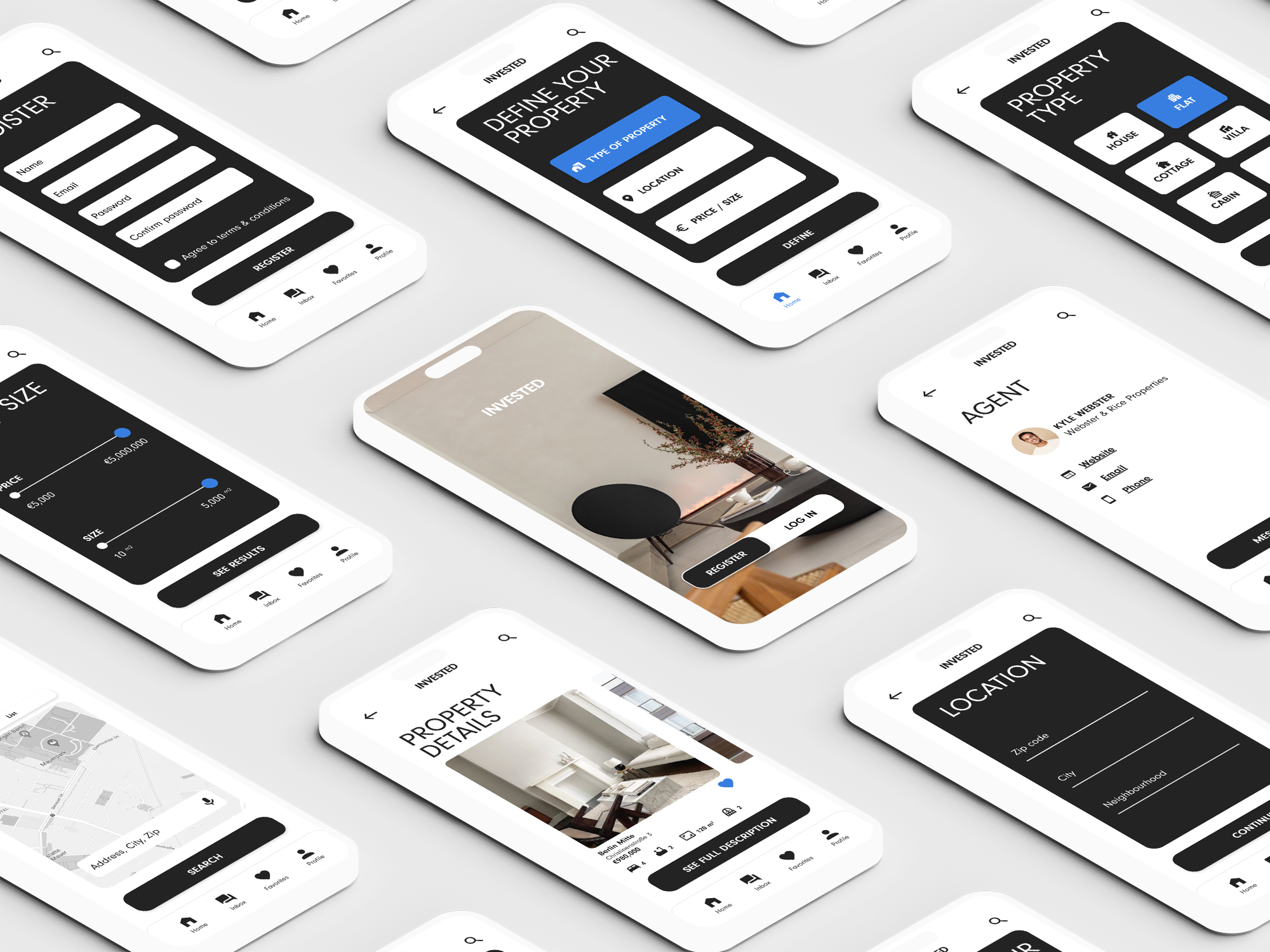
high-fidelity mock-ups
Video demonstrating Invested real estate app in action, highlighting property search features and smooth user interactions, designed by Victoria Scranton.


