
hart bakery

Overview
Goal: As part of a small team at Gretel in New York City, I had the opportunity to develop a unique brand identity for a bakery situated in Copenhagen. You can find more details here.
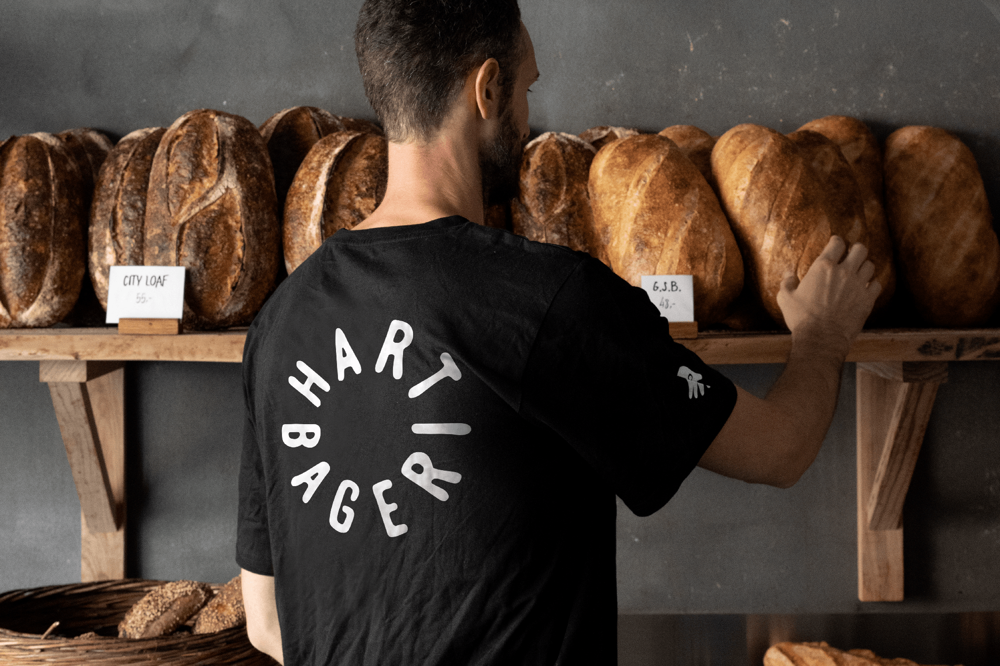
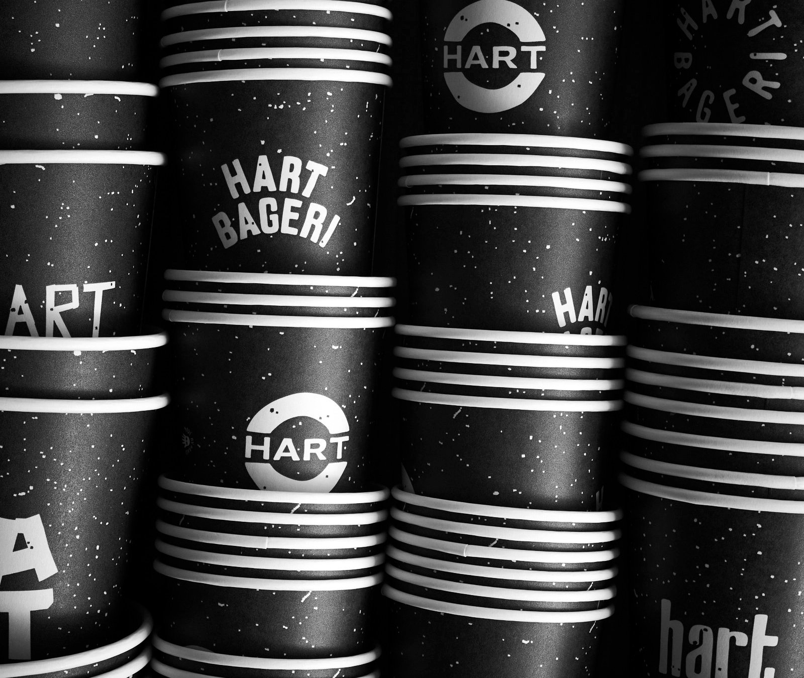
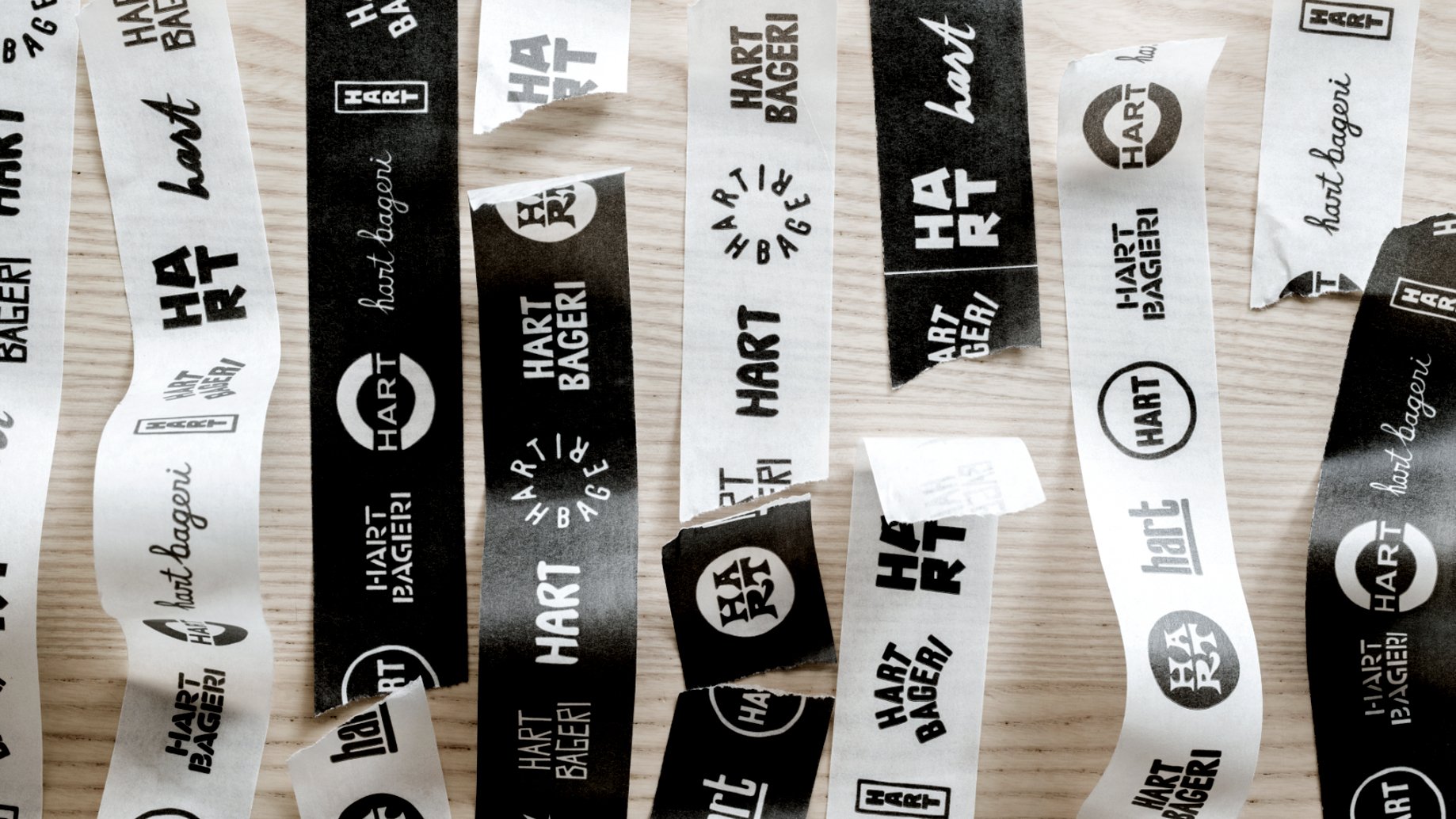
Solution: To reflect the expressive personality of baker Richard, we developed a spontaneous visual language built around hand-drawn wordmarks and logos. The display typeface, Freehand Blackletter, adds distinctive character, while Graphik provides a clean, modern counterpoint for supporting text. A black-and-white palette underscores the straightforward, no-nonsense spirit of Richard’s baking and the brand itself.

Hart Bakers Mark

Hart Exterior

Type Specimen


Punch Card
Tape

Cards